Sunday 26 July 2015

V&A

V&A


This week I spent some time looking around the V&A museum. We saw the Alexander McQueen exhibit, Savage Beauty, which was pretty amazing. While his stuff isn't my style at all, it was definitely interesting to look at and quite awe inspiring. Some of the dresses he designed were absolutely crazy, I personally was really impressed with the dress that was completely covered in oyster shells. Unfortunately no pictures were allowed, but other exhibitions allowed photography so here are some highlights...


I really liked the the "What is Luxury?" exhibit. One of my favorite pieces was this lamp made from dandelions and bronze circuitry. I thought it was a really interesting and beautiful piece.


This piece by Stanislav Libensky was also one of my favorites. This picture doesn't do it any justice, but the light quality is really interesting. Libensky played with different treatments of the two sides of the piece, so one side is more matte while the side shown is glossy. The opacity is also played with by  the thickness of the glass. It probably isn't considered a must see in the V&A, but I thought the design was exceptionally beautiful. 


This room in the V&A in general was amazing to me. Just the size of the objects in here were amazing to me. Also, what is pictured is Trajan's column (in two pieces...thats how big it is!) And I learned about it in architectural history. It's always fun to see something you've studied in depth in person!! 


Serpentine Pavilion

Serpentine Pavilion


This weekend on a stroll through Hyde Park I visited the Serpentine Pavilion. This was quite exciting, as the Serpentine Pavilion is one of the most visited architectural sites in the world. Every year since 2000 a prestigious architect has designed a new temporary pavilion for the park. Past architects include Zaha Hadid, Daniel Liebeskind, Sou Foujimoto and Frank Gehry. So many of the past architects to design the pavilion are incredibly inspirational to me, so I was super excited to see it in person!


This year the pavilion was designed by Spanish architects Selgascano. The structure itself is very interesting, made out of a colorful plastic material and ribbons. the spatial experience within is supposed to refer to the flow of movement in London's underground system, somewhat organized but also a bit chaotic. There are multiple spaces to explore, and different passages to take you different places. I thought this was an interesting source of inspiration, and definitely makes sense now that I have read their design explanation. 

To learn more about this year's pavilion, check out: http://www.serpentinegalleries.org/exhibitions-events/serpentine-pavilion-2015

Sunday 19 July 2015

Wayfinding in Copenhagen

Wayfinding in Copenhagen


This weekend my friends and I visited Copenhagen! It was quite fun, but I was definitely concerned about finding my way around a city in which English is not the primary language. It was actually quite alright (as most people speak English anyways), and we were able to navigate relatively easily.

Add caption

 Heres a map of the airport. It isn't beautiful, but it does the job. 


Hey! I know what that means!


English! we made it out alive. 

Signage in Copenhagen

Signage in Copenhagen


This weekend some of my flatmates and I spent the weekend in Copenhagen! It was quite lovely, and I would definitely recommend! We lucked out with the weather, and had a great time exploring the city. Here are some cool examples of signage if found on the trip!


 This was the cafe called voulez-vous we ate breakfast at on Saturday. It was absolutely delicious. I loved the quaint exterior of the shop.


This cafe was located across from voulez-vous. Though we didn't go in, I enjoyed the logo and use of contrast with the fonts.


 This sign was located outside of a hotel near the little mermaid statue. I loved the use of chalk to add some pizazz to the menu. 


Sunday 12 July 2015

RCA SHOW

RCA SHOW


Last Sunday I went to see the final thesis show for students at the Royal College of Art. I was quite impressed by the work the students did, and made me excited to get back to studio in the fall. I mainly looked at the schools of architecture and sculpture, but the school has many other departments.


Ahhh 3d printed models! This particular exhibit was for a building that was based off bible verses, each model represented a different verse. Don't ask me how they interpreted the verses into models... it honestly doesn't make sense to me but I found it really interesting and displayed beautifully. 


I loved the contrast in the photographs this student used.


This stack of paper was located across the room from the patterns painted on the wall across from it. You can see the direct connection the artist is showing, pretty cool!


These are smashed flat screens...there was an entire room filled with them! They looked like they were artfully destroyed...must have been an expensive project. 


I love this technique for model building! It gives a natural look to the model, as opposed to the 3d printed models that are typical today. 


Bus design

Bus design


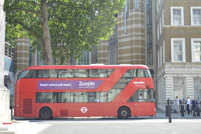
While out and about in London, one of the things I have realized is how some of the busses are designed differently. After doing a bit of research, I was surprised to learn that my new favorite English designer, Thomas Heatherwick. According to his website, the bus is a bit longer than the older version, has two staircases, three doors, and uses 40% less fossil fuel. The corners of the bus are rounded to make it appear a bit smaller, and the front window is angled sown so the bus driver doesn't run over people (which I see as a serious probability here...). Overall, the design is just far superior in the updated bus, so if you're looking to take the bus instead of tube, make sure to hop on Heatherwick's bus!


Here you can see the difference between the busses. The One on the right is the newer design by Heatherwick, while the one on the left is the older version. 


If you want to learn more about the bus design, check out Heatherwick's website: http://www.heatherwick.com/london-bus/

Sunday 5 July 2015

Brighton

Brighton


This weekend I visited Brighton with some flatmates. This town is absolutely adorable, and had some really cute shops. Some of the places we visited had really beautiful branding and products. 


We bought lunch at the Flour Pot Bakery, which was absolutely delicious. I really loved the simplistic design for the logo, though I liked my sandwich even better. 


After lunch we visited the Angel Food Bakery, where we all got cupcakes. I thought this logo was also really cute, though I preferred the one from the Flour Pot more. It looks more playful I suppose, but I like the simplicity of the Flour Pot.


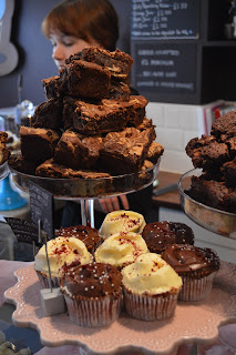
But seriously, look at those decadent brownies and cupcakes. Delicious!

Chanel at Harrods

Chanel at Harrods


Monday was what I like to call the perfect day. After visiting the Brands Museum, Kaylie and I went to Harrods. After browsing shoes, clothes, and anything else you could possibly think of, we ventured up to the sixth level to look at perfume. There, we were welcomed by a lovely red head named Sophie. I have never met someone who was so passionate about perfume, and I honestly didn't know there was so much to know about smelling. She told us the history of each scent she sprayed, giving us details of her typical clients and what the most popular perfumes are around Europe. She even gave us a small sample of No. 5 perfume, which is absolutely beautiful. 

Chanel has stunning brand design. It is so simple and elegant, and fits the perfume delightfully. The sample cards we received show some of their branding, which oozes a sense of low profile glamour. The word Chanel is much bigger and bolder than the perfume names, so it visually draws your attention. The font is simplistic and graceful, which is fitting for the scents and fashion associated with the brand. Typically Chanel isn't very bold or trendy, but more so timeless and elegant. The type and branding are perfectly fitting for their look.


*on a side note, to conclude my perfect day I received an email that my stolen purse was found on London Transit!!! YAY!

Saturday 27 June 2015

St. Pauls // London Info Centre

St. Pauls // London Info Centre


On Thursday after our tour of Fleet St., a few of us walked around the area some more. We then returned to St. Paul's to take another look at it. Upon walking around, I saw a glimpse of what I then thought was the work of Daniel Libeskind. I later discovered that it was not, but just an imitation of his work by another British firm Make Architects. 

On to the design aspect... I really enjoyed the contrast between the very clean, modern form and the classic cathedral. I think one of the things that I have learned from architecture at poly is that it is important not to simply immitate architecture from before our time, even if it is beautiful. The truth is that a building like St. Paul's cannot and should not have competition for attention, St. Paul's will always win. Using extreme contrast in this case is the most effective way of complementing the cathedral. It is simple and clean, and doesn't try to take anything away from the beauty of St. Pauls. 

Paternoster Vents

Paternoster Vents


This past Thursday, our GRC class took a tour of Fleet St. The first destination on the tour was St. Paul's Cathedral. After walking around the cathedral for a bit, we headed off to the next destination. Before doing so, however, we passed these two massive sculptures. I was extremely excited, because I recognized these as the work of one of my favorite British architects, Thomas Heatherwick. I have browsed his website several times, so immediately recognized this piece immediately. It was a delightful surprise! 

The sculpture was initially designed to hide a cooling system for an underground substation.The form was inspired by paper folding, which makes me happy, as one of the first projects first year architecture students do involves paper folding. 


To check out the paternoster vents and any other projects by Heatherwick, take a gander at the link below:


http://www.heatherwick.com/paternoster-vents/